


Installation
Usage
The CardDeck requires an array of image objects. For the best visual result, ensure the wrapping container has a defined height or aspect ratio suitable for cards.
import { CardDeck } from "@/components/ui/card-deck"
const cardData = [
{ src: "/ace-spades.jpg", alt: "Ace of Spades" },
{ src: "/queen-hearts.jpg", alt: "Queen of Hearts" },
{ src: "/king-diamonds.jpg", alt: "King of Diamonds" },
]
export default function GameBoard() {
return (
<div className="h-[400px] w-full max-w-sm">
<CardDeck images={cardData} autoplay={true} />
</div>
)
}Examples
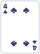
Custom Card Styles
The component is agnostic to the image content. You can use it for trading cards, tarot decks, or game assets. This example demonstrates using raw asset images without default rounded corners.


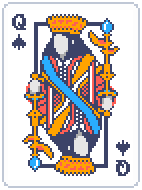
Balatro Card Deck
An example implementing Balatro-style assets, demonstrating how the stack behaves with high-fidelity, texture-heavy images.


Notes
For a consistent "deck" feel, all images in the images array should share the same aspect ratio. Mixing portrait and landscape images in a single deck may result in inconsistent layout shifts during swiping.
Container Sizing
The CardDeck takes up the full width and height of its parent container. You must wrap it in a container with defined dimensions (e.g., h-96 w-64 or aspect-[2/3]) to prevent it from collapsing.
API Reference
| Prop | Type | Default | Description |
|---|---|---|---|
images | { src: string; alt: string }[] | - | Required. Array of image objects to render. |
autoplay | boolean | false | Automatically cycles through cards at a set interval. |
showPagination | boolean | false | Displays pagination dots below the deck. |
showNavigation | boolean | false | Displays left/right navigation arrows. |
spaceBetween | number | 40 | The horizontal offset (in pixels) between cards in the stack. |
enableInitialAnimation | boolean | true | Triggers a “deal” animation when the component first mounts. |
className | string | - | Additional CSS classes for the wrapper. |