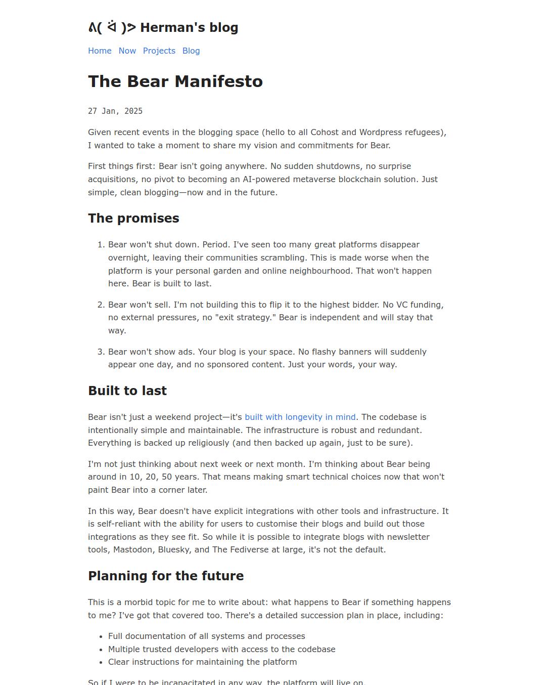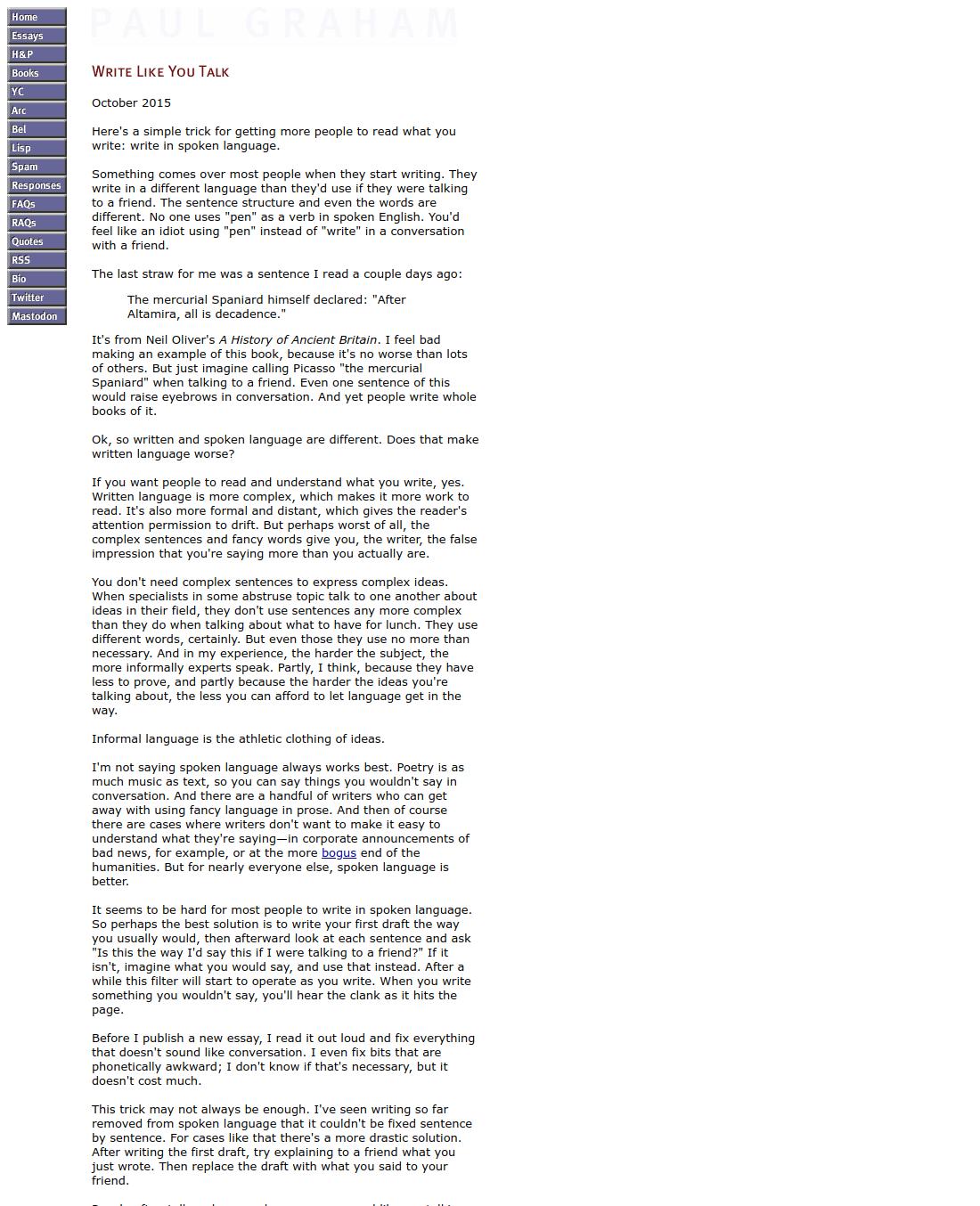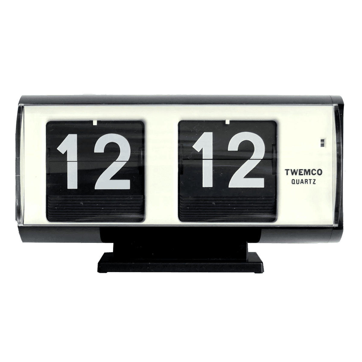
Twemco Clock
Clock
Installation
pnpm dlx shadcn@latest add @delta/product-cardUsage
The Product Card uses a compound component pattern to allow maximum flexibility in content composition.
import {
ProductCard,
ProductCardContent,
ProductCardHeader,
ProductCardImage,
ProductCardMetric,
ProductCardSubtitle,
ProductCardTitle,
} from "@/components/ui/product-card"
export default function Example() {
return (
<ProductCard className="w-[300px]">
<ProductCardImage src="/shoe.jpg" alt="Running Shoe" />
<ProductCardContent>
<ProductCardHeader>
<ProductCardTitle>Speed Runner 2</ProductCardTitle>
<ProductCardSubtitle>Performance Footwear</ProductCardSubtitle>
</ProductCardHeader>
<ProductCardMetric>$120</ProductCardMetric>
</ProductCardContent>
</ProductCard>
)
}Examples
Inner Layout
Use the inner variant to overlay content on top of the image. This is ideal for editorial content or high-impact visuals where space is limited.

Twemco Clock
Clock
Custom Content
You can overlay badges on the image to indicate status (New, Sale, Sold Out) using the ProductCardBadge component.
Sizing
The component accepts a size prop (sm, default, lg) which automatically scales padding, font-sizes, and badge positioning.
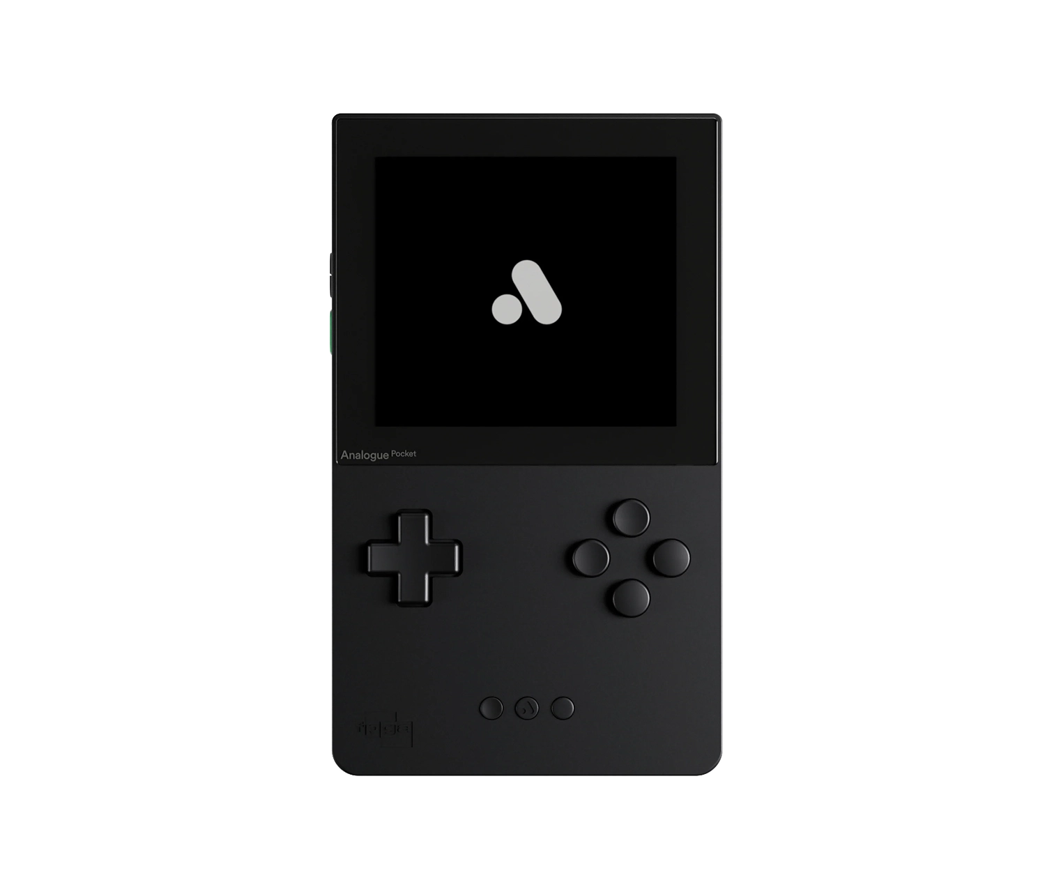
Analogue Pocket
Gaming Console
Grid Layout
Display multiple cards in a responsive grid layout. This example showcases an essay curation using the product card component.
Notes
Creating Images Like Used in Examples
To achieve the clean, product-focused look seen in the demos (especially for the inner variants), you need images with transparent backgrounds.
On macOS:
- Right-click your image file in Finder.
- Select Quick Actions > Remove Background.
- Important: This creates a transparent PNG but preserves the original canvas dimensions. You will likely need to crop the image afterwards to remove excess whitespace so the product fills the card correctly.
Alternatives: If you aren't on macOS, you can use free online tools like Adobe Express or remove.bg to achieve the same result.
Next.js Image Optimization
By default, this component uses a standard HTML <img> tag. As per the Source Code Ownership philosophy, if you are using Next.js, you should modify product-card.tsx to use the next/image component for production.
// In product-card.tsx
import Image from "next/image"
// ... inside ProductCardImage
<Image
src={src}
alt={alt}
fill
className={cn(...)}
/>Aspect Ratio
The image container enforces a strict aspect-square (1:1) ratio by default. To change this for portrait or landscape cards, override the class on the ProductCardImage sub-component:
<ProductCardImage
  src="..."
  alt="..."
  className="aspect-[3/4]" // Override for portrait mode
/>
API Reference
ProductCard (root)
The root container component.
| Prop | Type | Default | Description |
|---|---|---|---|
| variant | "default" | "inner" | "default" | Card layout variant - "default" shows content below image, "inner" overlays content on image |
| size | "sm" | "small" | "default" | "lg" | "large" | "default" | Card size affecting padding and text sizes |
| onCardClick | () => void | - | Callback when the card is clicked |
| className | string | - | Additional CSS classes |
ProductCardImage
Image container with standard img element.
| Prop | Type | Default | Description |
|---|---|---|---|
| src | string | - | Image source URL (required) |
| alt | string | - | Image alt text for accessibility (required) |
| imageClassName | string | - | Additional CSS classes for the image element |
| className | string | - | Additional CSS classes for the container |
ProductCardBadge
Interactive badge overlay for the image.
| Prop | Type | Default | Description |
|---|---|---|---|
| isActive | boolean | false | Whether the badge is in active/selected state |
| icon | React.ReactNode | - | Icon to display before label |
| onClick | (e: React.MouseEvent) => void | - | Click handler (stops propagation automatically) |
| className | string | - | Additional CSS classes |
ProductCardContent
Container for the card's text content.
| Prop | Type | Default | Description |
|---|---|---|---|
| className | string | - | Additional CSS classes |
ProductCardHeader
Wrapper for title and subtitle.
| Prop | Type | Default | Description |
|---|---|---|---|
| className | string | - | Additional CSS classes |
ProductCardTitle
Product title heading.
| Prop | Type | Default | Description |
|---|---|---|---|
| className | string | - | Additional CSS classes |
ProductCardSubtitle
Product subtitle or category.
| Prop | Type | Default | Description |
|---|---|---|---|
| className | string | - | Additional CSS classes |
ProductCardMetric
Metric display (price, rating, etc).
| Prop | Type | Default | Description |
|---|---|---|---|
| className | string | - | Additional CSS classes |
On This Page
InstallationUsageExamplesInner LayoutCustom ContentSizingGrid LayoutNotesCreating Images Like Used in ExamplesNext.js Image OptimizationAspect RatioAPI ReferenceProductCard (root)ProductCardImageProductCardBadgeProductCardContentProductCardHeaderProductCardTitleProductCardSubtitleProductCardMetric
